
Data Explore
Get to the root cause,
not just the symptom.
Plot any signals together over any timeframe, with operators' notes on the same timeline, to trace an issue to its root cause.
The workspace
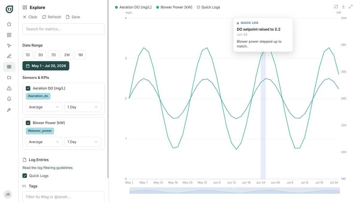
Ask a question you didn't plan for
Pull up any sensor, any KPI, any window, in seconds. When you're done, close it. Nothing to clean up.
The chart
See what moved together
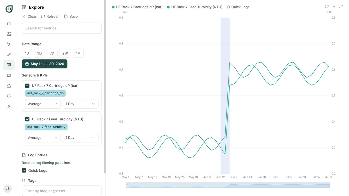
Most investigations come down to one question: did these two things move at the same time? The chart is built to answer it with no setup in the way.
Signals on one chart
Plot anything against anything, so you can see what actually moved together.
Dual axes
When the units don't match, each signal keeps its own scale instead of flattening.
Any window you want
Presets from a day to a year, or pick your own. Drag to zoom into the part that matters.
Take it with you
Download the CSV if you'd rather finish the work in a spreadsheet.
Quick logs
The data says what happened. The log says why.
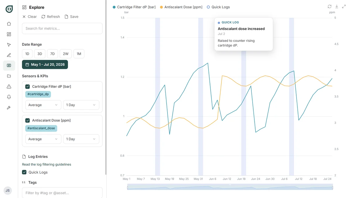
Log entries sit as markers on the chart's time axis, so the note about a dosing change lands directly against the data it explains. A historian can tell you the number changed. It can't tell you an operator swapped a chemical at 2 p.m.
Write it while you're looking at it
Quick Logs adds an entry without leaving the chart, so the note gets written while the detail is still in front of you.
Tag it so it comes back
Tag the asset and the log appears whenever anyone pulls up that train. Tag it #handover and the next crew finds it.
Show only the events you care about
Filter the chart by hashtag or asset, so a year of logs narrows to the cleanings, or to one piece of equipment.
How you'd work an event
From “what happened” to “why”
The order matters more than the tools. This is how an engineer works backward from a symptom to a cause.
Start before the event
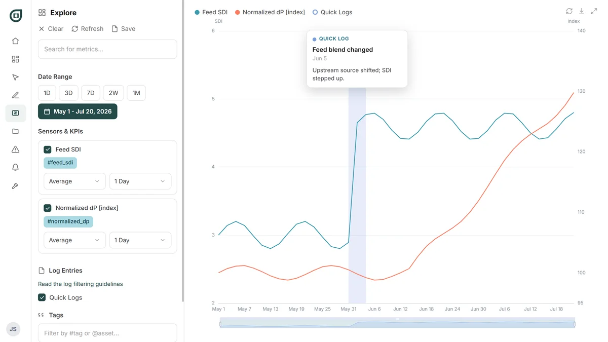
A sudden problem: a day either side. A gradual one: a week. Something slow needs 30 to 90 days before it's even visible.
Add the parameter that showed it
Then add whatever could plausibly be driving it.
Look at which one moved first
The sequence usually points at the cause.
Then hand it to Zed
“Feed pressure dropped from 12 bar to 9 bar while flow stayed constant. What could cause this pattern?” You spot the shape; Zed explains it.
"Explore or Dashboards?"
Different tools for different jobs
Both put your plant's data on a chart. The difference is whether you already know what you're looking for.
A dashboard is persistent
The same metrics, always current, because you already know they matter.
Explore is ad-hoc
One question, right now, about data you've never looked at this way before.
Most teams need both
Explore is where you start.
Pani Core · Pani Enterprise
Interested in Data Explore?
Explore is included in both Pani Core and Pani Enterprise.
Compare plansRelated capabilities